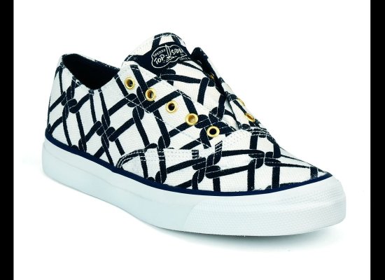
kate does florence…
 …and milly for sperry topsider.
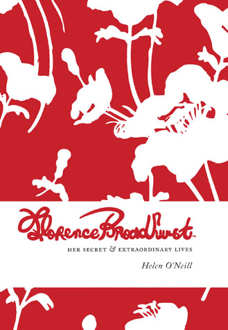
i first fell under the spell of florence broadhurst on a trip to sydney back in 2006. i found the beautiful book above at a little home furnishings boutique and was completely struck by the gorgeous textiles. it was one of those ‘look what i got!’ kind of moments. the australian designer was larger than life with her iconic wallpaper prints featuring contrasting over-sized blooms, natural themes and graphic icons popped with mylar, metallic inks, flocking, etc. i was in love!
 florence broadhurst’s japanese floral
fast forward to 2012 and the public has been introduced to ms. broadhurst through a resurgence of her designs including several retrospectives of her works, some of them not seen since her death in 1977. suddenly home furnishings are cropping up in new york showrooms and her prints are finding their way into posh boutiques world wide.
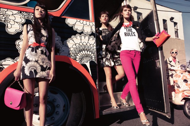
so it should come as no surprise that the fashion world should want in on the game and my curiosity was peaked when reading the release on kate spade’s collaboration with florence broadhurst prints. i’m a sucker for blown up prints on buses and bikes but, there was something about the collection that fell a little flat for me.
i think it might have been the overkill of black and white throughout the ad campaign. more often than not, her colors being limited to 2 or 3, ms. broadhurst featured a sophisticated range of palettes throughout her contrasting prints rarely using black alone. i know this is supposed to be kate spade’s take on the broadhurst designs but there is a joylessness in how the collection is featured which runs contrary to the richness of the original wall coverings.
 i have the nanette lepore original below from her spring 2007 collection…
 …kate spade could have taken a note or two on color and styling.
 black polka dot stockings with a lightweight spring dress, shudder.
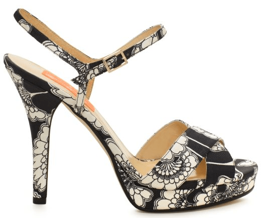 really? again, print is great but the shoe shape, zzzzzzzzzz…….
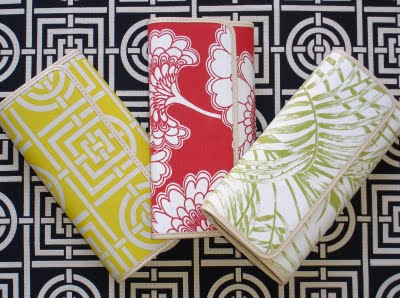
the totes and handbags were equally predictable and one dimensional. the clutches were a nice try but too bad the rest of the campaign failed to capture the feeling of this little grouping. broadhurst’s designs are present and accounted for yet the materials and styling make the gorgeous prints look so matronly and dowdy. patent leather trim would have added a modern touch or a little gold toned hardware would have upped the chic factor. sadly, this looks more like kate spade for florence broadhurst for target.
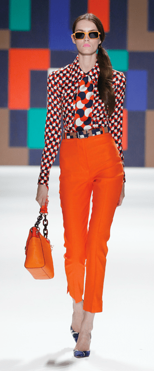
now, moving on to a designer who seems to know how to harness the exuberant essence of the color blocked sixties and seventies and funnel it into a modern day interpretation exuding high octane energy.
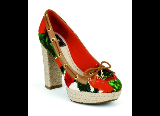
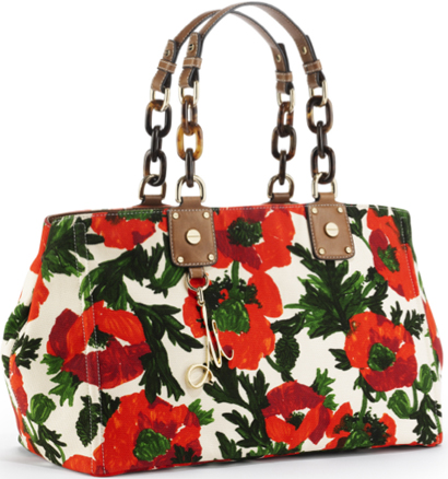
milly, who tends to appeal to the same customer, has trumped the competition by infusing the youthfulness lacking in kate spade. michelle smith doesn’t play it safe when it comes to bold colors and pattern mixing. her collaboration with prep staple sperry topsider, features her own signature prints and hardware which enlivens the ugliest of shoes. i’ve never seen the appeal of the sperry topsider but her take on the line injects playfulness in an otherwise dull as dirt brand.
hel-lo! gold leather laces, signature hardware, tortoise shell links and a use of color that is vibrant and appropriate for spring. conservative but cute! when i think of floral printed bags, i suddenly lean to the right usually preferring to keep bags simple in order to maximize their use. however, this bag reads retro-chic and i’m pretty sure i can find a way to rock it without it looking mumsy!

